10 Features of an Effective Modern Business Website
When we think of modern web design, we often picture sleek layouts, bold typography, animation and beautiful imagery. Those things can all contribute to a good website, but a website doesn’t become modern simply because it looks contemporary.
Some of the most important characteristics of an effective website are much less visible.
How quickly does it respond? Can people find what they actually need? Does it work properly on different devices and for people with different accessibility requirements? Can search engines understand it? Does it connect appropriately with the systems used elsewhere in the business? And can you tell whether it is actually achieving anything?

At Brown & Brown, we think the starting point should always be the organisation and its users. The requirement determines the technology, rather than the technology determining the solution.
That means there isn’t a single set of fashionable features that every website needs. An AI chatbot might be useful for one organisation and completely unnecessary for another. The same applies to animation, video, interactive tools, ecommerce and almost every other visible feature.
Instead, here are ten characteristics we think matter when designing an effective modern business website.
What about the latest web design trends?
Dark mode. Oversized typography. Micro-animations. Video backgrounds. AI chatbots. Unusual navigation. Interactive graphics.
Every year brings another collection of features described as essential to modern web design.
Some will be useful. Some will be appropriate for particular audiences or brands. Some will disappear again.
The more useful question is:
Does this help the website do its job?
A visually spectacular website that takes too long to load, confuses its users or makes important information difficult to find isn’t particularly modern in any meaningful sense.
Conversely, a relatively restrained website can be highly sophisticated if it makes a complicated organisation easy to understand, connects intelligently with the systems behind the business and helps customers accomplish what they came to do.
Modern web design is therefore less about following trends and more about making appropriate decisions.
1. It has a clear purpose
Before deciding how a website should look or which technology should power it, there is a more fundamental question:
What does the organisation actually need the website to achieve?
For an ecommerce business, that might mean helping customers find and purchase the right products. A professional services company may need to generate appropriate enquiries. A healthcare provider might need to help prospective patients understand different treatments before deciding whether to book an appointment.
Those are very different requirements.
They also demonstrate why measures such as traffic aren’t objectives in themselves. A business with finite appointment capacity, for example, doesn’t necessarily benefit from attracting the largest possible audience. It may be much more valuable to help the right people understand what is available, answer their questions and make an informed decision.
That purpose should influence everything that follows, from information architecture and content to functionality, calls to action and measurement.
2. It helps people find what they actually need
Navigation is only one part of this.
Good information architecture starts by understanding what people are trying to accomplish and organising information around those needs.
For a relatively simple business, that may mean a clear hierarchy and a handful of well-labelled pages. For a more complicated organisation, it could involve search, filtering, categorisation, location data or several different routes through the same information.
The important thing is that the complexity of the organisation doesn’t have to become complexity for the user.
Helping homebuyers navigate a complex property portfolio
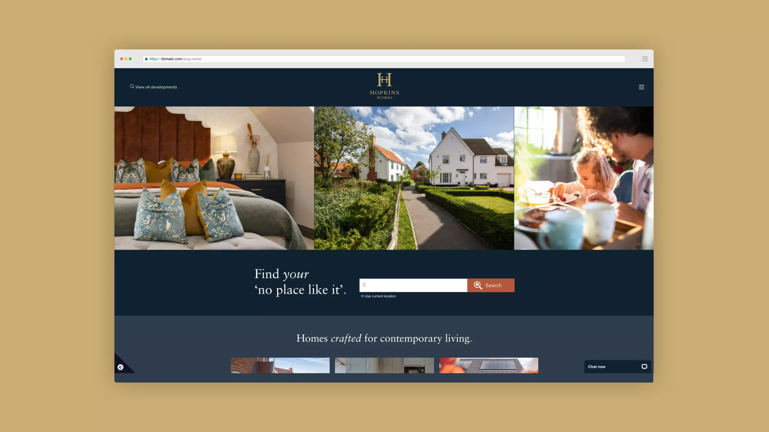
When Brown & Brown took responsibility for the digital platform used by Hopkins Homes, a major housebuilder operating across East Anglia, the website was much more than a collection of marketing pages.
Customers needed to search developments and available homes using criteria such as location, property type, bedrooms and price. Behind that experience sat relationships between developments, individual properties and geographic information.
The website allows prospective buyers to narrow the available properties by the criteria that matter to them, making a large portfolio easier to search.
3. It works properly on different devices
Responsive design has been a fundamental part of web development for years, but simply making a desktop website shrink onto a smaller screen isn’t enough.
People use websites in different circumstances and on a huge variety of screen sizes, connection speeds and input devices.
Layouts need to reflow appropriately. Navigation needs to remain usable. Text needs to remain readable. Buttons and controls need to work comfortably with touch. Forms need to be practical on smaller screens.
This is why designing for different screen sizes is more useful than trying to predict particular devices.
The GOV.UK Design System, for example, explicitly recommends starting with small screens and designing for different screen sizes rather than making assumptions about the devices people will use.
4. It is fast and technically efficient
Speed affects how a website feels to use long before somebody starts thinking consciously about its performance.
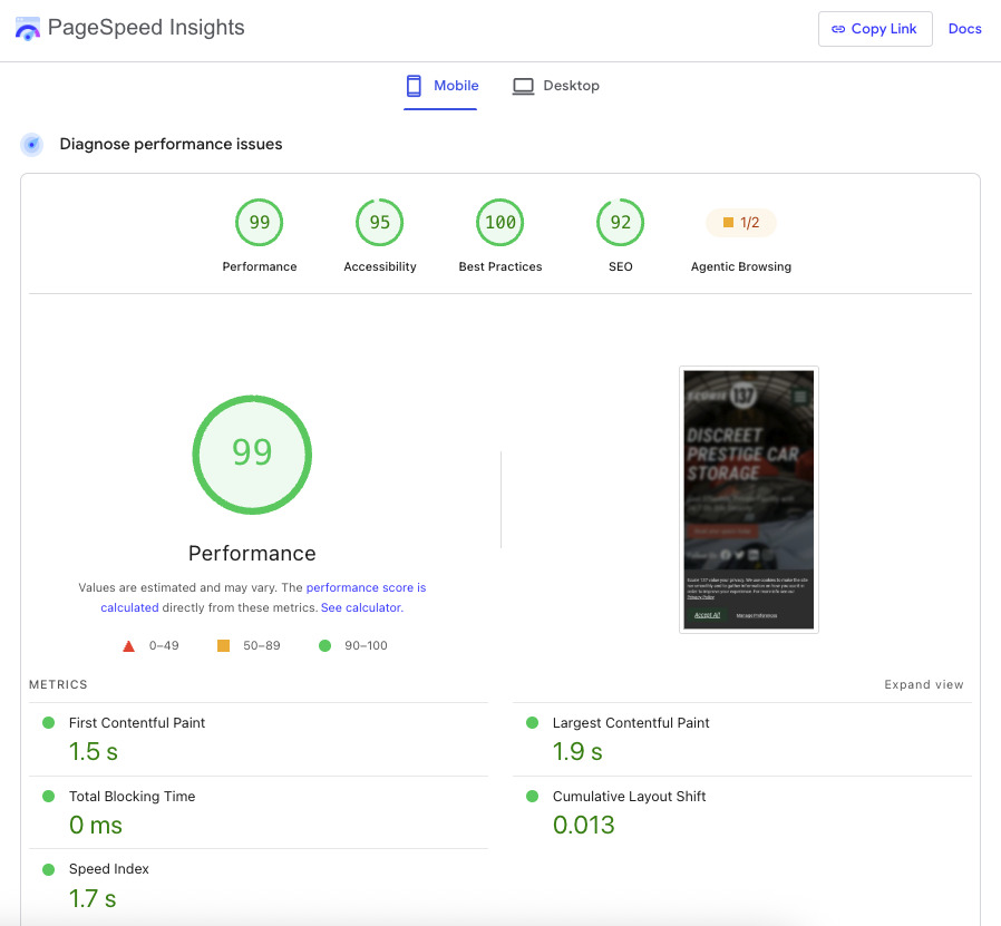
Useful content should appear quickly. Interactions should respond promptly. Elements shouldn’t unexpectedly move around while the page is loading.
Google’s Core Web Vitals provide useful measurements for these aspects of the experience, including Largest Contentful Paint (LCP), Interaction to Next Paint (INP) and Cumulative Layout Shift (CLS).
But website performance isn’t simply a technical exercise carried out after the design has been completed.
Design decisions have performance consequences.
Large images, video, animation, advertising scripts, tracking platforms, third-party widgets, fonts and JavaScript frameworks can all add something useful to a website. They can also add weight and complexity.
That means there is often a trade-off to consider.
The most appropriate solution isn’t necessarily the one using the most technology.
5. It is accessible to as many people as possible
Accessibility isn’t an optional feature for a particular group of users. It is part of designing a good experience.
The Web Content Accessibility Guidelines, or WCAG, organise accessibility around four broad principles: websites should be perceivable, operable, understandable and robust.
In practice, that affects decisions throughout design, content and development.
Colour contrast needs to make text and controls distinguishable. Images may require meaningful text alternatives. Forms need clear labels and understandable errors. Page structure should make sense to assistive technologies. Interactive functionality should be usable without relying solely on a mouse. W3C guidance specifically requires keyboard access to functionality as part of WCAG.
A useful example: GOV.UK
GOV.UK is deliberately not an exercise in visual extravagance. Its design system prioritises clarity, consistency and accessibility across services used by an exceptionally broad audience.
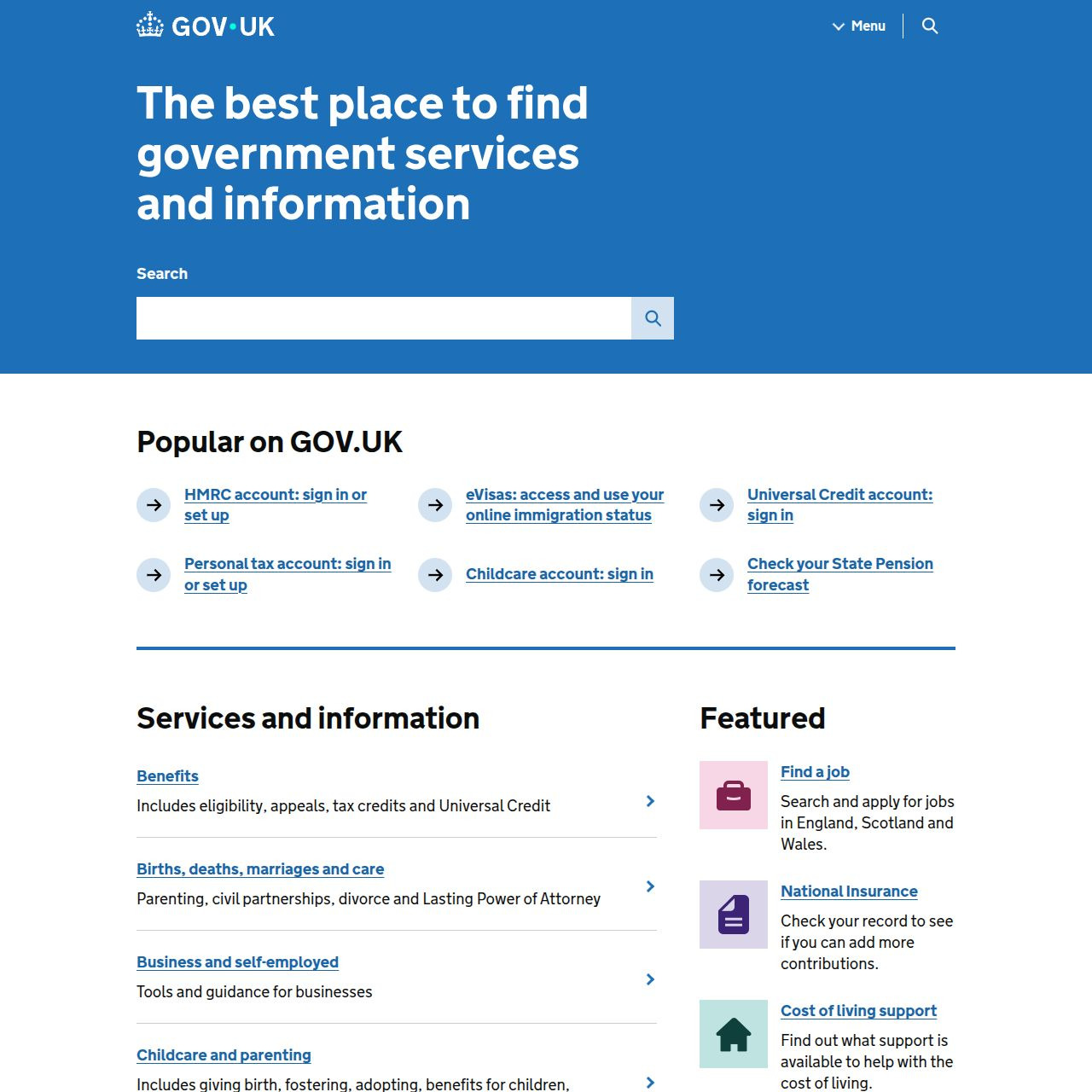
Its published Design System includes accessible components and patterns, keyboard focus states, responsive layouts and guidance for testing services with assistive technologies. The Design System itself states that using accessible components isn’t enough on its own: accessibility still requires research, design, development and testing.
That’s an important distinction.
6. It communicates clearly with search engines and other systems
A website needs to make sense to more than the person looking at the screen.
Its underlying structure helps browsers, search engines, assistive technologies, social platforms and other systems interpret what its content means.
That starts with good foundations: meaningful HTML, sensible heading structures, logical URLs, crawlable navigation, appropriate metadata and properly implemented canonicalisation where required.
Structured data can provide additional machine-readable information about the meaning of content. Google describes structured data as a standardised way of giving it explicit clues about a page and classifying its content, which can also make pages eligible for certain enhanced search results.
Technical SEO therefore shouldn’t be something sprinkled onto a website immediately before launch.
It overlaps with information architecture, content, development and performance.
A well built, modern website should give both people and machines a clear understanding of what its information represents.
7. It makes important interactions simple and reassuring
Good interaction design often goes unnoticed.
Fill in a form correctly and it progresses as expected. Make a mistake and the website explains what needs correcting. Click a button and there is immediate feedback that something is happening.
These small details remove uncertainty.
Forms can validate information before submission. Loading states can show that a request is being processed. Confirmation messages can make it clear that an action succeeded. Error messages can explain how to recover when something goes wrong.
A useful example: Stripe
Payment processing is a particularly good demonstration because entering payment details is both important and potentially stressful.
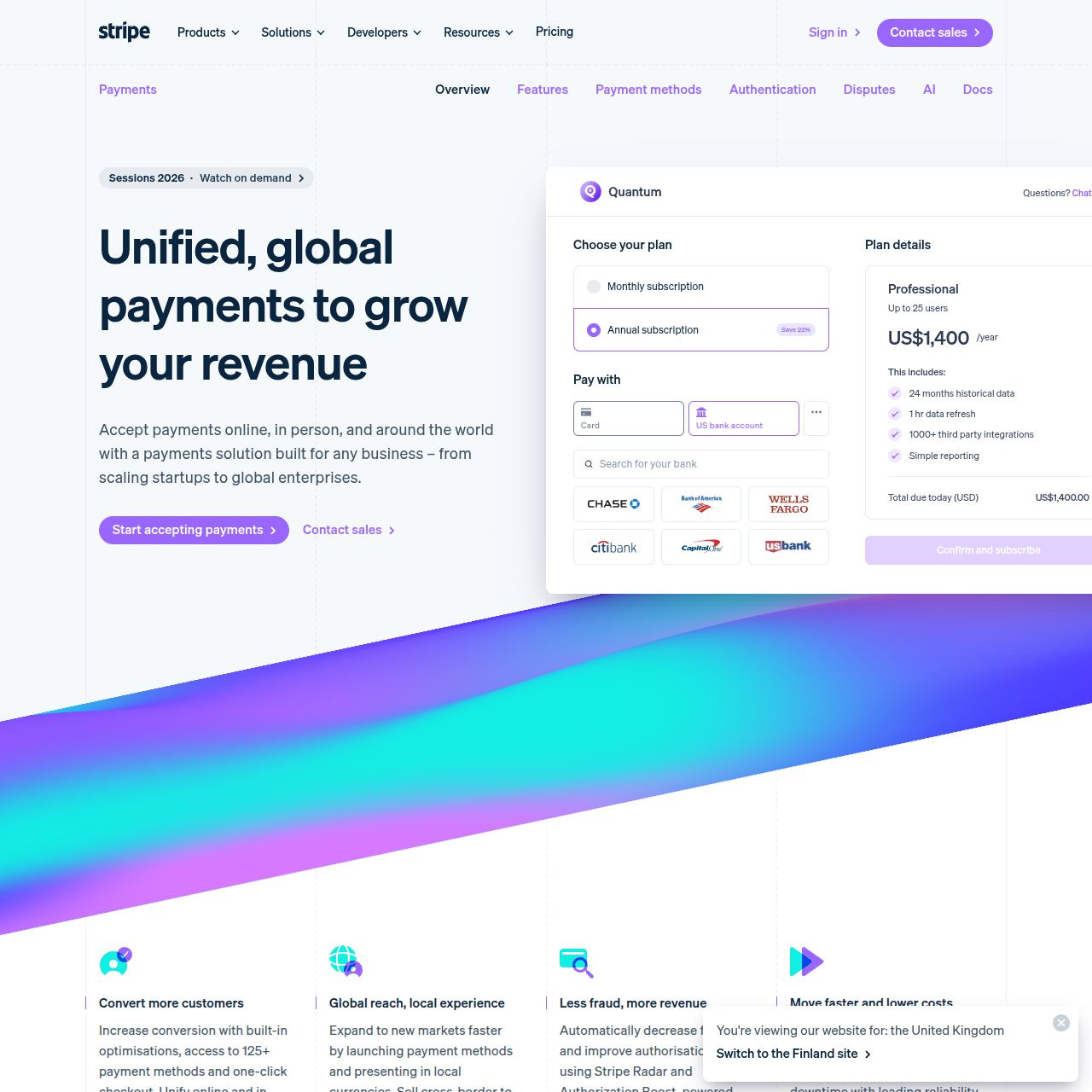
Stripe’s Elements interface includes functionality such as client-side validation, input masking, autofill, accessible ARIA support, responsive layouts and localised error messages.
None of those features exists simply to make the checkout look more impressive.
They help people successfully complete a task.
That’s a useful way to think about micro-interactions generally.
8. It protects users and handles their data responsibly
HTTPS is now a baseline expectation rather than an advanced website feature.
Modern website security and privacy go considerably further.
Forms need appropriate protection. Software needs maintaining. User permissions need to reflect what people actually require. Dependencies and third-party services need to be understood. Personal information should only be collected and retained where there is a legitimate reason for doing so.
Privacy creates another layer of complexity because websites frequently communicate with analytics, advertising and marketing platforms.
Cookie consent shouldn’t therefore be treated merely as a banner that needs adding to the bottom of the page.
What happens before somebody gives consent? What happens afterwards? Which systems receive information? Is the organisation collecting data it genuinely needs? Can useful measurement still take place while respecting the choices users make?
These are design, technical and business questions at the same time.
A secure website is not simply one with an SSL certificate. It is a website whose wider data flows have been properly considered.
9. It connects with the wider business where necessary
This is one of the characteristics of modern business websites that is easiest to overlook.
Established organisations rarely operate their website in isolation.
They may already use accounting software, ERP systems, CRM platforms, booking systems, stock management, dealer databases, property systems, email marketing platforms or specialist internal software.
The easiest website to build might ignore those systems and ask somebody to enter the same information again.
That isn’t necessarily the best solution.
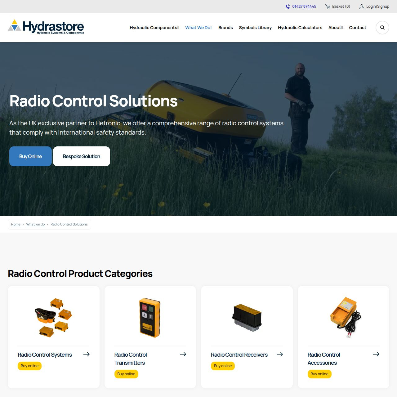
Connecting Hydrastore’s ecommerce website with Business Central
Hydrastore is a specialist supplier and manufacturer of hydraulic components and systems. Its online catalogue contains highly technical products, including product families with multiple configurations, and not everything displayed on the website can necessarily be purchased in the same way.
Behind the website, Hydrastore integrates with Microsoft Business Central as part of its wider business operation.
When Brown & Brown redeveloped the ecommerce website using WordPress and WooCommerce, the requirement therefore wasn’t simply to build an online shop. Product information, pricing, availability and web orders needed to work appropriately alongside Business Central and Hydrastore’s existing processes.
10. It measures what matters and can evolve
Launching a website shouldn’t be the end of the design process.
Search behaviour changes. Businesses change. Products change. Customers behave differently from the way we expected. Browsers and privacy requirements evolve. New marketing channels appear.
An effective website therefore needs appropriate measurement behind it.
That might include analytics, Search Console, ecommerce data, enquiry tracking, Google Ads conversions, user behaviour analysis or information from systems elsewhere in the business.
The important word is appropriate.
Collecting enormous quantities of data doesn’t automatically produce useful information. Measurement needs to reflect the questions the organisation is trying to answer.

One customer journey across multiple websites
Brown & Brown has worked with Country House Weddings, a collection of exclusive-use wedding venues, for more than two decades.
Its digital presence has evolved into more than a single website. A prospective couple might discover Country House Weddings through its main website or an advertising campaign, explore the website of an individual venue and ultimately make an enquiry elsewhere within the wider digital estate.
That creates an interesting measurement problem.
If you consider every website independently, you risk losing sight of a customer journey that deliberately moves between them. But combining everything without understanding those journeys can introduce different problems with the quality and interpretation of the data.
As browser privacy, advertising platforms such as Google and Meta, and server-side conversion tracking continue to evolve, our work therefore involves understanding how customers actually move through the estate before deciding how measurement should be structured.
So what makes a website modern?
Not necessarily dark mode or an AI chatbot, although both have their place.
Not a particular animation style, CMS or JavaScript framework.
Those things may all be appropriate in the right circumstances, but none of them makes a website effective by itself.
A genuinely modern business website brings together several disciplines.
It needs good design, but it also needs clear information architecture, useful content, accessibility, performance, security, technical SEO, appropriate integrations and meaningful measurement.
Most importantly, those decisions need to be made in the context of the organisation behind the website.
Understanding what needs to be communicated, who needs to understand it and what needs to happen next still comes first.
Have a website problem that doesn’t fit neatly into a package?
From straightforward fixes to complex systems and custom customer journeys, we focus on the problem first. Let’s talk through what your business actually needs.
Talk to us about your project