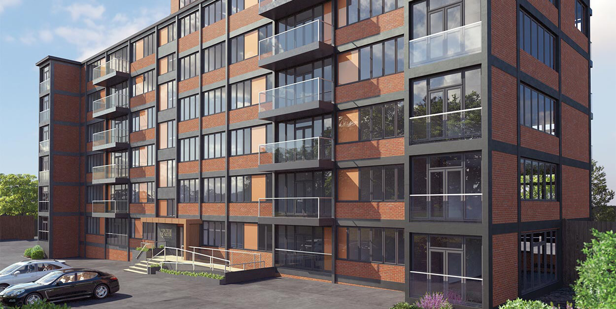

Cura are another business that we have worked with for many years. As is so often the case, the services we offered to begin with were small and simple to reflect their budgets and requirements. As their business has expanded, so their marketing requirements have also quickly grown.
We had to adapt their original logo to start with because they didn’t want to make the changes too obvious.
The logo has been updated every few years since and now represents the bigger entity they have become.
The first site was launched in 2011. Again, it has gone through a couple of iterations and major updates as their client base and portfolio have grown in strength and depth. They are now working on a more diverse range of high end property developments and the central role of the website is to present their outstanding projects in a way that reflects their high level positioning.
With each rebrand they have always followed through with full changes to supporting material. Each time we have provided new and better design and printed solutions to their fairly extensive stationery requirements!
How can we help? Let's talk it through.
Get in touch